


I’m in love with the views all around our little farm house. Each season brings a new thing to love. The sun stretches across our property in the most majestic manor each day and even the rain brings with it a sense of tranquility to our little piece of land.
Behind our house, the wild grasses grow tall and just beyond that, a row of small pinetrees a pruned by the landscaping company who owns them, being so handsomely groomed to someday add charm to someone else’s yard. To the east, is the neightbor’s farm. It once was an dairy farm, but now the barn sits empty with the silo still standing tall. It’s just behind this barn though that the sun rises each morning shining its brilliant golden rays across vast acres of overgrown grasses.
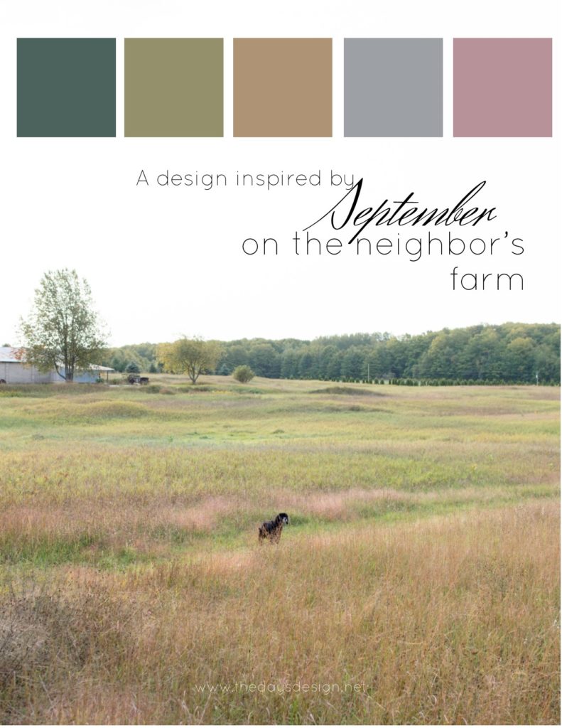
When I look upon this grass, I see more than just the expected hues of green. It’s the complex palette that nature has provided that is inspiring this post today.
This is the beginning to a new series here on the journal, we’ll be building designs around everyday scenes in our lives. Whether you’re looking for inspiration for your living room, a dinner party or a full wedding design – this series is for you. I’ll create a color palette based on the picture, some flowers to bring that palette alive and then some textile elements that will further enhance the overall vision.
Without further ado, this is a look at September as I look out my door to the east and into my neighbor’s back yard.

Various shades of green and tan immediately catch my eye. But upon further contemplation, I see subtle mauve and grey tones as well with so much texture it makes me giddy.
The palette above encompasses most of what I see, one could take it a bit further and add in some brillant golds or mustards, but I like keeping it calm and a little more muted – color without a bright “pop”.
The flowers I would use to recreate this scene are simple. Lots of grasses, a few larger focal flowers and just a touch of mauve-y brown.

As I was thinking about these colors in floral form, I was reminded of this bouquet I made last summer. It had a very similar vibe, although one might consider this the July version of this color palette.

Flowers are a huge part of what I do, so I like to provide inspiration for them whenever I’m creating a design. However, visuals for a space – whether it’s your home or an event – go far beyond that. Adding dried grasses and texture to your coffee table or into a wreath will undoubtable bring nature in, but we can do that in other ways as well.
Below are some textiles that I would use to describe the above scene. Fringed blankets and pillows, stoneware dishes and the casual sheen a dupioni silk. Warm velvet gives some softness to the space while wood and wool add in more natural elements. This space would feel slightly modern and cozy all at the same time.

Caramel China from CB2 | 2. Shimmer Linens in Thyme | 3. Hand-dyed Gold Velvet Ribbon | 4. Wayfair Buffalo Check Pillow | 5. Casual Throw: available to rent or similar to purchase | 6. Chairs: available to rent or purchase | 7. H & M Matte Grey Vases (no longer available to purchase but available to rent from my inventory), purchase similar on Amazon
What do you think, would you design a space based on that view or would you rather just look at it from your window? I’ve got more fall inspiration on deck but this post today is all about easing us into the process.

The above links are not affilates, just references for easy shopping.


Do you have the names of those colors ??
Would love to know.
I don’t, I used a color grabber tool but could probably find them. What would be most helpful? Pantone or another source?