We’re now six days deep into July and it’s taken me this long to dig through my portfolio to find a somewhat patriotic, or red white and blue flower arrangement. While these colors might not be every bride’s dream palette, it doesn’t seem like it would be that difficult to find something with a little red in it.
This little challenge of mine has got me thinking, once again, about color. I just can’t seem to get the impact of it off of my mind. Color is everywhere.
Through this searching process, I have realized why there’s very little red, white and blue in my work. Perhaps not that surprising unless you’re part of a military wedding. But the real reason is, red doesn’t inspire me. I don’t choose to add it into my creations. After all, how am I supposed to work with a medium I’m not inspired by?
Of course I’ve had brides tell me that they’re using shades of cherry, burgundy, garnet, marsala and berry in their palette. We’ve always worked together to bring this vision to life in a way that is inspiring and artful to both of us. But just red, count me out.

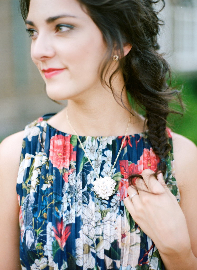
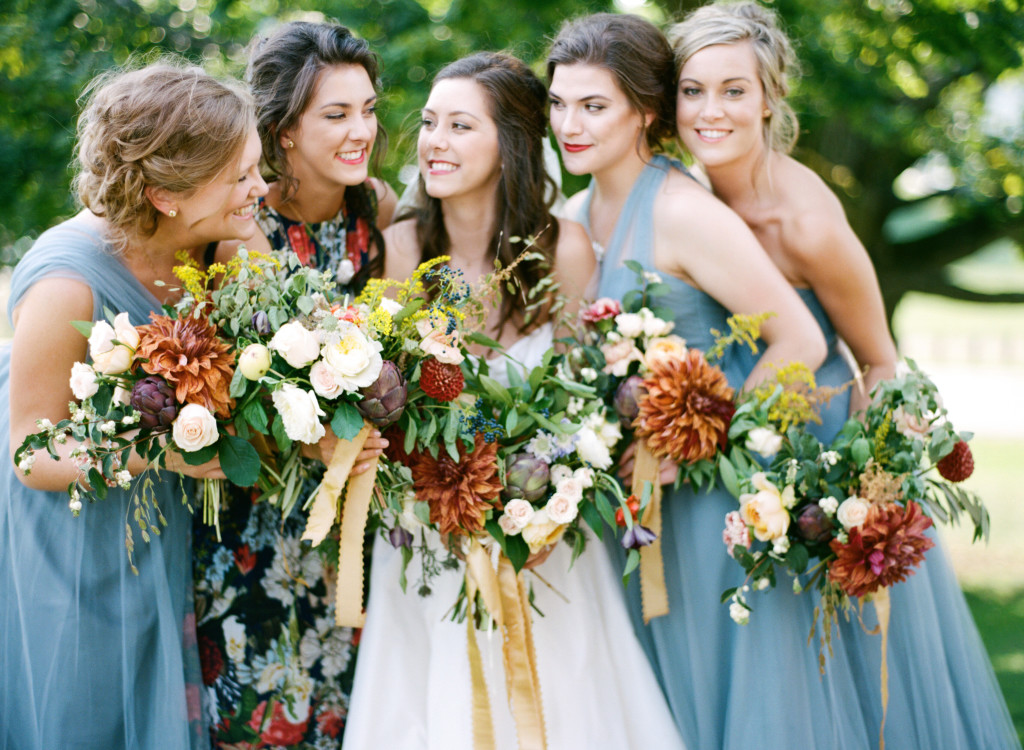
Perhaps one of my favorite sources of color inspiration was when dear Mary showed me a picture of her maid of honor’s blooming dress. The dress was clearly fabulous but suddenly I was panicked, I would have to use red flowers.
And then she told me how much her and the groom love food. I started dreaming of eatible berries and olive branches and other seamingly obvious ingredients. But then, I started taking a deeper look during my weekly grocery shopping trips and examining the various tones in the produce section. Their wedding flowers were no longer about color, but a feeling and a representation of them. I began to reshape my thought process and take notice of the small details in the everyday world around me. I experienmented with wiring chilis into buttonholes and scheming of how to sneak a few apple branches from my neighbor’s tree. Trips to the farmer’s market, searching through greenhouse herbs, bay leafs, lavender, peppers, artichokes and pomegranates created a palette that wasn’t just pleasing for the eyes but really was good enough to eat. Together, we worked to find something that was beautiful to both of us – and it’s one of my favorite weddings to date.
So if you’re presented with an obstacle in your wedding planning that at first glance may seem less than ideal, don’t be afraid to think outside of the box and tackle the challenge. Sometimes you just need to approach things from a different angle and not be so quick to judge a color (or venue, chair, suit, etc).
Photography: Cory Weber Photography
Hope everyone had a safe and happy holiday!

And if you want to see my chili pepper buttonhole, pop on over to instagram – it’s red, white and blue perfection!
0
LEAVE A COMMENT
View Comments