Another winter month in which the landscape seems a little desolate. There’s still too much white out there, not leaving much room for the colorful foliages and blooms I long to see as I look out the window. But again, I’m thankful that the floral industry has evolved so that we can at least have blooms inside. Its actually a fantistic time of year for flowers as other parts of the country are starting to celebrate spring.
I did things a little out of order this month due to Valentine’s Day, so you may have an idea of what flowers I’m going to talk about and how I’ve already used them together from looking at my Valentine’s tablescape that I shared last week. Even so, I’m going to share 5 flowers that had me inspired for the holiday and what it is that I love about these choices.
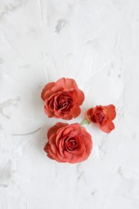 Chococinno Spray Roses
I’m picky about my shades of red. I like something that’s red without being “red” – you get that, right?! These are sometimes categorized as rust, brown or can even seem more burgundy and using any of those descriptors makes me happier than saying I’m using red roses in an arrangement. They’re California grown spray roses and have a ton of flowers on each stem. They also have a really great vase life and open up nicely. All excellent traits for a flower.
Dried Leather Leaf Fern in Red
Another red that isn’t “red”. I’d say it’s much closer to burgundy. In fact, the first couple photos I took of this guy 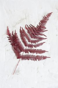 were so dark that it just looked colorless. It’s perserved, so this fern does not need a water source. It is dyed and some of the color did rub off on my fingers when they got a little moisture on the leaves, that’s you’re little warning. Beyond that though, it’s a beautiful foliage, long elegant lines and something a little unexpected to add into your arrangements.
Dried Phalaris in Berry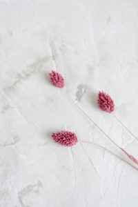
I found this on a dried decor website and loved the idea of adding him into corsages and buttonholes. I ordered it and fell in love. Now I see that my wholesaler is also selling him and I’m tucking him into any arrangement I can.
Upright Pepper Berries
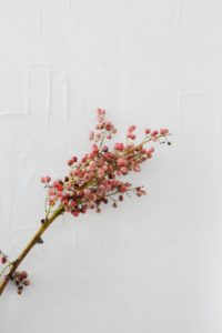 In my early days of designing flowers, I used pepper berries quite often. But I got away from them, finding them bulky. They usually are in a more hanging variety, which weighs more and pulls an arrangment down. They work well for a board accent in an arrangement but there was little else that I used them for. However, these don’t have the drooping habit of the traditional pepperberry and as such, are easier to work with. They still are a great boarder or framing textural accent, but have a little more life and spring to their step. I love the color, it’s blends well with blush, pink, cranberry, red, really any of those tones because there’s almost a speckle on the berry that makes it more of a matte finish and not round a shiny like one might expect a “berry” to be. This speckle makes it less of a solid color and more of a mixture of various shades of rouge.
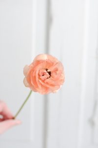 Ranunculus
Is there anyone that doesn’t love the ranunculus?? This is a standard variety in peach. But again, it’s a peach that fluctuates from salmon to pink to coral – so many shades in each bunch. And when the centers open up to reveal a little black stamen, it makes me so happy. I use these flowers throughout the spring and would use them even more if they could just figure out how to make all the stems a little sturdier. Sometimes the stems get mushy or have to be wired and sometimes they’re as strong as can be – you just never know what you’re going to get. One place they always work well though is in a corsage. They have an amazing flat back and last well outside of water.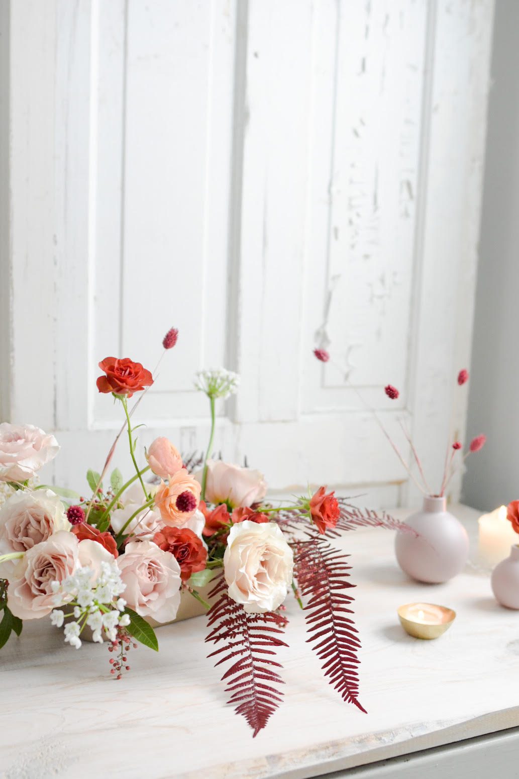
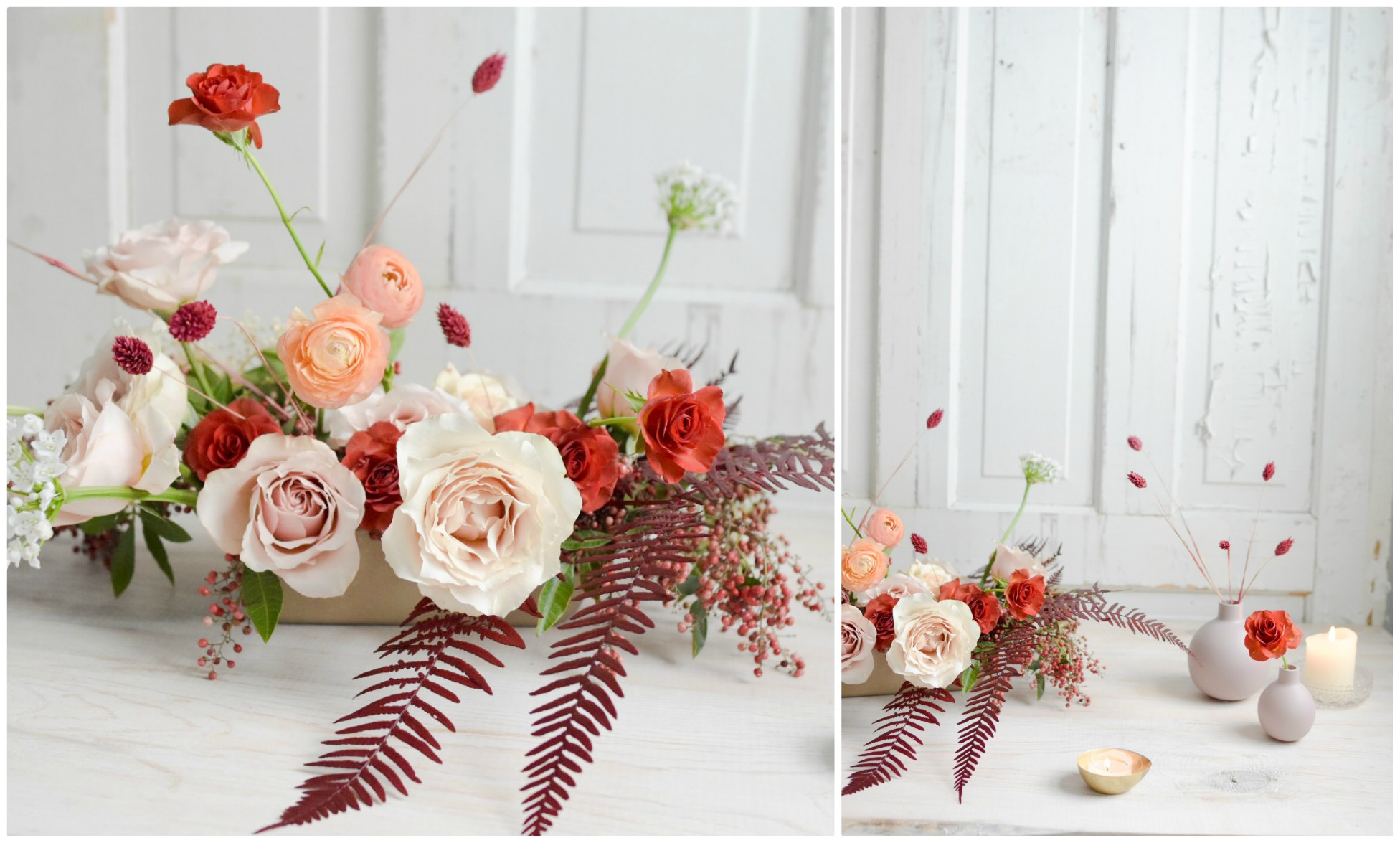
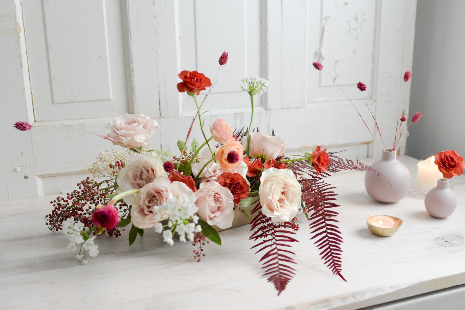
Did you see the tablescape that we designed with these blooms last week? If not, you should see how we added a little gold and mustard in with these blooms to make the perfect warm and inviting combination. And if there are ever any blooms or colors you’d love to see me feature, I welcome your ideas, feel free to comment below.

LEAVE A COMMENT
View Comments