


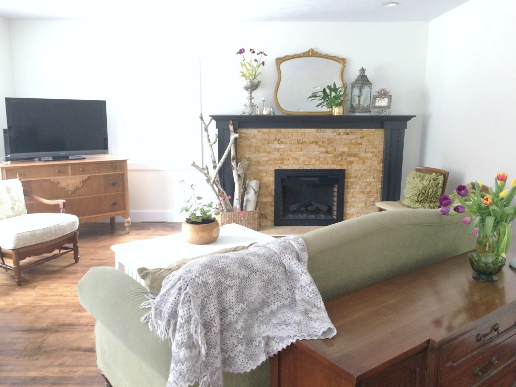
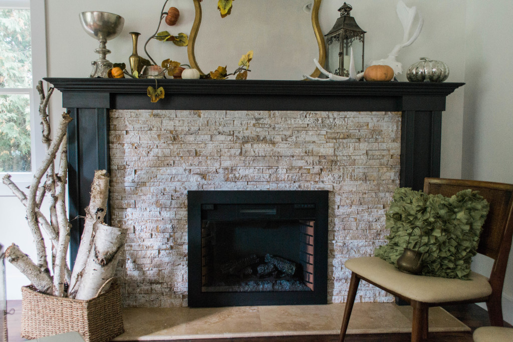
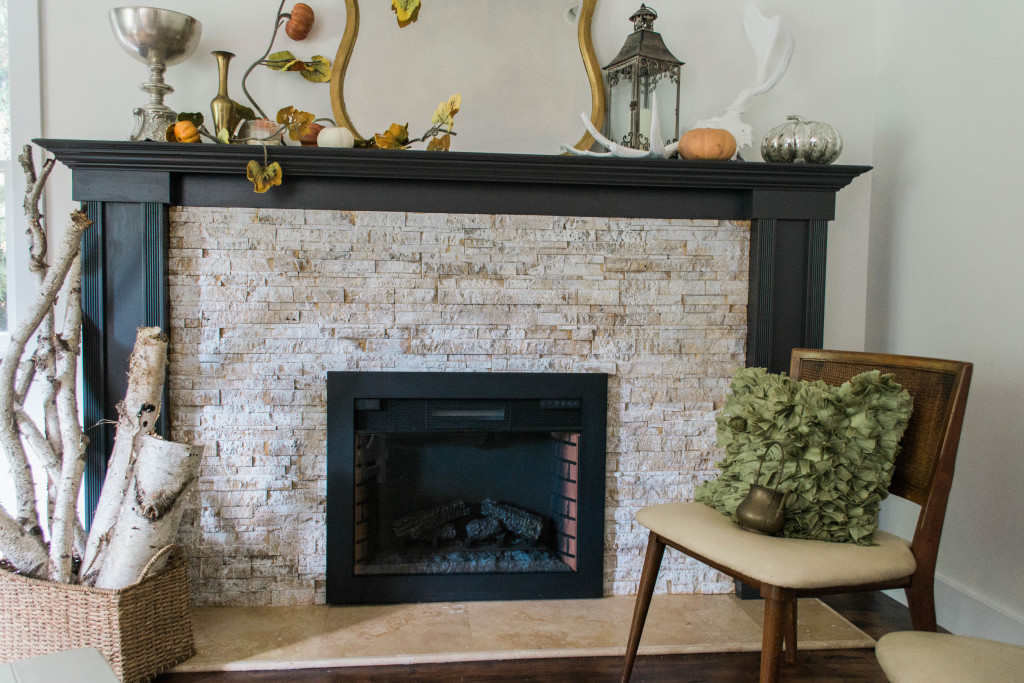
The previous owners of our house did an amazing job of making sure that everything flowed from room to room. This included matching the travertine tile on our fireplace with that on the kitchen backsplash. They used the same tile in two different shapes. However, there were two flaws with that plan. First off, even though they were the same stone the colors were different. I saw a sample of each tile and side by side they look identical color-wise, but they must have come from two different dye lot batches in the end and some strong amber undertones were very present in the fireplace tile. This might have been well enough, except that when we moved in, of course, I had to disrupt that color flow by adding a few of my own spins and style into the space which created the second problem. I really wanted the living room to have a brighter, more airy feel but in doing so, the travertine tile in that room suddenly became an eyesore. I really thought I could live with it but the spicy brown tones were entirely too rusty and soon enough my mind only registered orange every time I walked into the room.
Without completely tearing apart my fireplace (which I would absolutely love to convert back to it’s original fieldstone and wood burning glory), paint seemed like the best option. I was tempted to paint the entire thing stark white. I thought an opaque look would be modern and edgy. But I’m much more comfortable with the imperfections of the whitewashing process so I decided to start there, since I could always add more paint and make it completely opaque but I could never reverse it the other way if I didn’t’ like it.
I was also really cheap on this project and used paint that I simply had laying around the house. The entire venture only cost me $9, and it would have been $6 if I had liked the paint color I originally bought for the black mantle (more on that later).
Items needed for this project:
- Paint brush
- Water
- Paint (I used Annie Sloan’s French Linen, Sherwin Williams’ Alabaster and Sherwin Williams’ Greek Villa for the tile and Sherwin Williams’ Agreeable Grey and Sherwin William’s Wintersweet Grey for the actual mantle
- Containers for mixing the paint
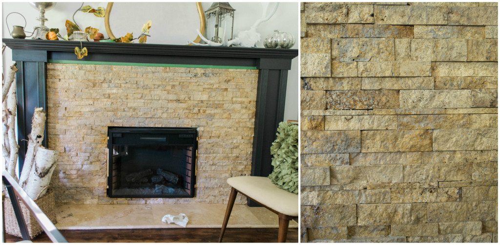
Here’s the before photo (and I’ll apologize in advance for the shotty photography throughout the entire post).
Step 1
The first thing I wanted to do was whitewash my tile. However, I did my first coat in grey. I wanted to add some depth and texture and layer the colors like you would naturally find in brick or stone. So I used Annie Sloan’s French Linen paint. You wouldn’t have to use chalk paint, but I did because I had leftovers and I really like the warm grey of this color. I thinned it down by adding water. The paint because ever so slightly transparent in my dish, I still wanted to keep lots of grey pigments. I didn’t measure exactly but it was pretty close to 2 parts paint, one part water. If you do thin it too much, just add more paint to the mix or you may just have to do more coats of paint.
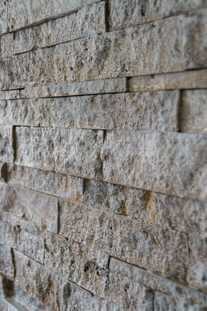
You could hardly see any difference when I finished this step. The change was very very subtle because travertine is such a porous stone, it soaked up a lot of paint. This will remain true in all of the following steps as well. I let it dry for a couple hours, or until it was dry to the touch.
Step 2
I repeated step one again. I saw very little grey on my tiles and I really wanted it to cover the orange more than it was so I added another coat. These coats were all slopped on really quickly with a two inch paint brush, I didn’t worry about perfection since I wasn’t trying to attachive a perfect look.
Step 3
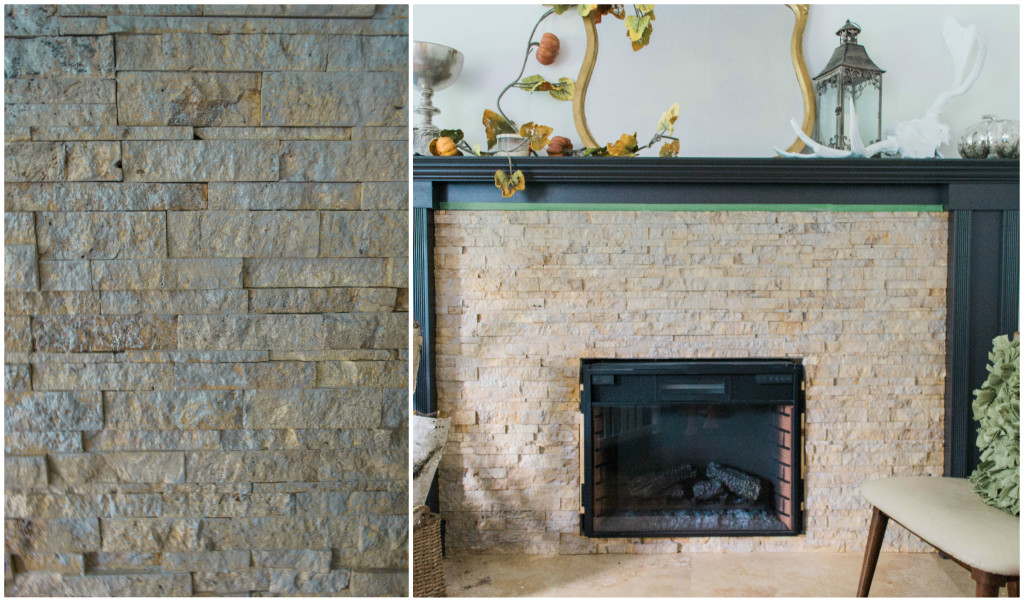
This is where I started playing with white paint. I used Sherwin Williams Alabaster paint in an eggshell finish. This is the same color paint that is one my living room walls and a great way to use up some leftovers. I thinned it down to the same consistency as the grey and slapped a coat on. The tile was still absorbing a ton of paint but I could see a few specks of white when I finished with this layer.
Step 4
Another layer of white was added when this one dried. I was tempted to leave it at this point, but something just didn’t feel right. It seemed really stark and cool against the rest of the room, which was strange since I used the same paint color that is on my walls but all the warm tones in that paint completely disappeared. So onto step 5.
Step 5
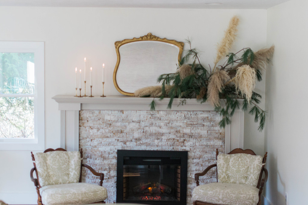
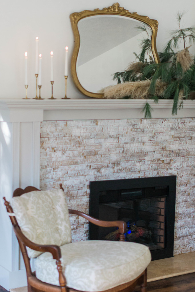
I actually had to go to the paint store. Thank goodness for those $3 little samples since that’s all the paint I needed. I picked up Sherwin William’s Greek Villa – a color that seemed way too creamy yellow to ever be considered on my walls, but I felt the extra warmth with be perfect on the fireplace. I was correct. I thinned this color down also and placed a generous layer on the tile. I only added one layer of this color and walked away.
Step 6
I lived with this for a few days but realized how badly I really want to paint to actual mantle white to match my trim. My husband, on the other hand, was having none of it. I couldn’t leave the idea alone. I like the contrast of black trim and the boldness it has to offer, but it’s not for me – I am light, bright and neutral in my décor choices. So we struck a compromise and painted it grey.
Back for another $3 sample. We chose Sherwin Williams’ Agreeable Grey – seemed like the perfect color to settle our dispute. The sample was a satin finish, which I always use on my trim pieces, and was enough paint to do an entire first coat on the mantle.
Step 7
A couple more days went by and I determined that this grey wasn’t really all that agreeable in my room. I had left the floor tiles in front of the fireplace their natural, beigy brown color since they didn’t have those rusty undertones. But the grey felt too cool against their warm tones. So for the second coat, I used Sherwin Williams’ Wintersweet Grey. It has the teeniest, tiniest tinge of brown in the grey and complimented the tile perfectly.
And I’ve lived with the finished project for about a month now and I think I’m really happy with it and finally ready to share the results.
Here are a couple other notes and helpful tips:
- I used Sherwin Williams paint but they don’t sell the small $3 samples. However, Lowe’s now carries Sherwin Williams colors and they do offer these little sample that I simply cannot live without.
- Make sure you step back and check your work often. The paint looks so different from across the room verses up close where you’re working.
- I always use satin finish paints for all of my trim work. It’s durable and can be wiped without appearing shiny.
- And I’m sorry, but I don’t have any notes to share about how durable this is or the longivity of paint on the tile.
Enjoy!


LEAVE A COMMENT
View Comments